BY: NICK RAGONE, JD
"Dear brothers and sisters, the Ascension does not point to Jesus' absence, but tells us that he is alive in our midst in a new way." — Pope Francis, St. Peter's Square, April 17, 2013

Illustration by Cap Pannell
In 2015, Ascension undertook a journey to remind ourselves and our communities that through our unified ministry, Jesus "is alive in our midst in a new way." Rebranding our ministry to One Ascension became one of the largest such initiatives among health care organizations. Just as our historic sponsors adapted to the needs of their times to best serve God's people, we sought ways to meet the evolving needs of our times. In addition to the industry shift toward value-based care with greater focus on health outcomes, the digital revolution and regulatory reform, we knew that consumer behavior was also changing.
More than ever, those we serve were making decisions based on access, affordability and convenience. As patients become more empowered, they have greater influence on health care choices and view them similarly to other brand choices. And new, non-traditional points of care have us competing for awareness against big consumer retail brands supported by large marketing budgets. We knew that it was incumbent upon our ministry to compete at the highest level on quality and cost while reminding consumers that our mission and ministry are "alive" in what we offer to patients.
As we sought to address the internal and external changes taking place, it was clear that a unified brand identity matters in the cauldron of competition, and that our brand must reflect our mission and remind patients that He "is alive in our midst in a new way." Our communities need to know what drives our commitment to quality care. They must see that the ministry of healing is different than the business of health care.
DISCERNMENT
As a ministry of the Catholic Church, we took great care in considering how to develop and implement a unified brand and identity strategy. The goal was always to magnify our mission and the healing taking place in our sites of care while finding ways to better serve together. Some questions Ascension leaders considered:
- How can we convey our identity through our brand and reputation?
- What differentiates Ascension?
- Where is the intersection of what people want out of health care and who we authentically are?
- How can we honor the heritage of our legacy health systems while connecting them to our unified identity?
Our true north throughout this discernment was our historic sponsors. Twenty years ago, when the Daughters of Charity and the Sisters of St. Joseph of Nazareth brought their health systems together to found our combined healing ministry, they made some key decisions we have been careful to sustain. They chose the name Ascension along with the Holy Trinity symbol and each design detail of our logo. And they carefully crafted our mission statement to guide every individual and every act of this ministry moving forward. As the Daughters and Sisters joined together to create their solution for the future of health care, they deliberately established these fundamentals, which later were reaffirmed by our other historic sponsors — the Sisters of St. Joseph of Carondelet, the Sisters of the Sorrowful Mother, and the Alexian Brothers — and that form the foundation of the Ascension brand identity. Today Ascension has 2,600 sites of care in 20 states and the District of Columbia.

A SHARED MISSION, A SHARED BRAND
Across our nationwide ministry, leaders, physicians, caregivers and associates engaged to discern answers to key questions and sought insights from those we were building this brand for: those we serve. Ascension's marketing team conducted extensive consumer research across the country to shape every decision and aspect of our brand. Decisions for the future would no longer be benchmarked by how things had been done in the past. Courageous spirit, widespread internal expertise and valuable consumer insights led us to the clear decision to make our internal One Ascension transformation an external reality through implementing a unified identity, which would require a shared mission and brand.
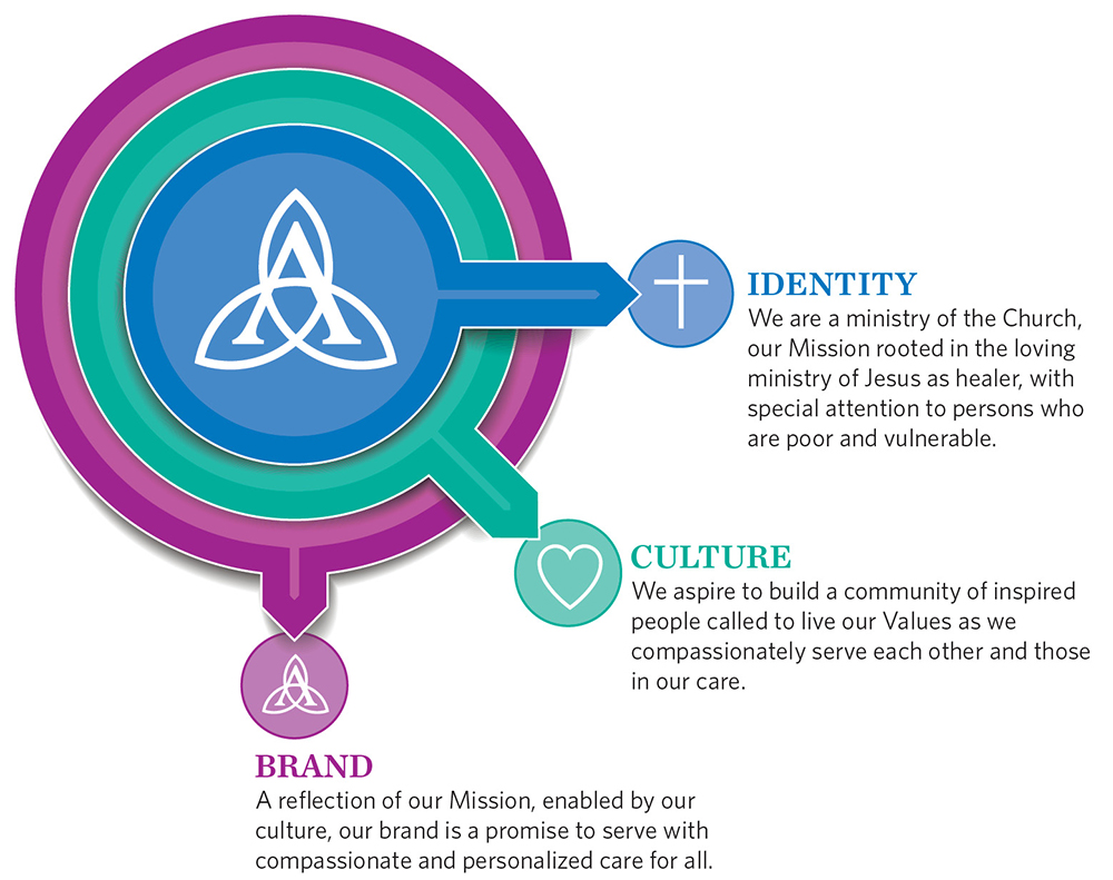
Although the mission statements of our health systems had always carried the same promise to care for the whole person and serve those living in poverty and in vulnerable situations, these commitments were articulated in slightly different language. Ascension's mission integration leaders recognized how meaningful it would be for all of Ascension to embrace the words thoughtfully and collaboratively crafted by our historic sponsors at the founding of Ascension. Now, "rooted in the loving ministry of Jesus as healer," we are committed in a more direct way to who we are as a ministry of the Catholic Church by articulating our purpose as to why we serve as a healing ministry.
Our unified brand reflects this shared mission to the outside world — a detail that is important as we extend our care for those living in poverty while adapting to the transformed, sophisticated consumer. Our brand and our care will remind all that He "is alive in our midst in a new way."
LOCAL HERITAGE, NATIONAL STRENGTH
Historically, our ministry's emphasis on local identity created an inconsistency in reputation that was complex and difficult to navigate, limiting our ability to optimize internal operations and collaborate across geographies. It also confined reputations of excellence to local communities, instead of allowing us to highlight key service lines across the country, since our health ministries were represented by the different local brand identities. To grow and transform health care locally and nationally, we had to find a way to harness the equity and heritage of 30-plus brands into one unified identity — no small feat.
Throughout the process, we emphasized that the transition did not signal new ownership, but a continuation of the same legacy of healing and service. Simply adding "Ascension" to the names of our local care sites demonstrates the reality that Ascension is additive to these legacies, never supplanting the trust and heritage of our health systems and hospitals. And we've been deliberate to show equity in these names as we have unified by making the legacy names the same size as Ascension in the logos that identify our care sites. Font size may seem to be an atypical act of reverence, but to us it was meaningful in signaling a newfound connectedness that relies on a balance between local care and national collaboration. This remains our unified brand strategy as we increase service line recognition and strengthen Catholic health care. The strategy includes the thought that the name Ascension is like a megaphone that amplifies the high-quality care provided in each of our markets and connects it to the innovations and successes of the rest of our physicians and caregivers across the country. It reminds all whom we serve that He "is in our midst" while they receive the high quality, compassionate care that they expect from community health care providers who have always been there for them.
A SHARED NAME AND LOGO
As we add the Ascension name to care sites across the country, it is important for us to emphasize the sacred significance of our name and logo that our historic sponsors chose 20 years ago at the founding of Ascension.
The Daughters and Sisters chose the name "Ascension" because it is the moment in Scripture when Jesus, before ascending to heaven, entrusted his ministry to his followers, sending them forth to be vessels of transformation. In the words of Pope Francis on Ascension Sunday in 2018, "the Ascension exhorts us to raise our gaze to Heaven, to then turn it back immediately to earth, carrying out the task that the Risen Lord has entrusted to us." This is what our historic sponsors saw themselves doing with the creation of Ascension — entrusting us with the implementation of Jesus' healing ministry that they established so we can continue their mission now and into the future.
They chose the Holy Trinity symbol as our logo, in colors they considered to be deeply symbolic — green for growth, blue for health and purple for compassion. The integration of the "A" in the trinity symbol was intentional as well. It signals our steadfast commitment to serve as a ministry of the church, something that will never change despite the ever-changing landscape of health care.
As Ascension, we reinforce to our 150,000 employees that our name and logo, and all that they stand for, act as a calling. They are positioned on our buildings and doors as a reminder to each of us that we are the living signs of our healing ministry in our communities.
PERSON-CENTERED AND RESEARCH-BASED
Our transformation has been and will continue to be driven by listening. It was only through copious research and meetings with our ministry market leaders, providers, volunteers, community members and patients that we came to understand what people want and how to best help our caregivers provide it. From our research, we learned that consumers make choices based on what is:
- Easy to find
- Easy to access
- Easy to remember

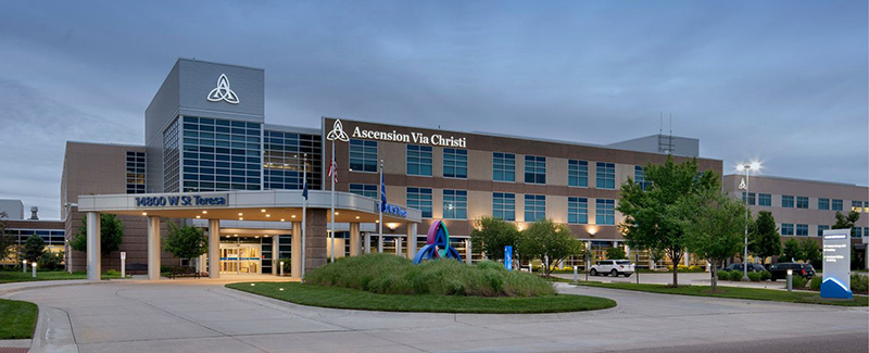
Ascension Via Christi St. Teresa in Wichita, Kan.
Fortified with that knowledge, our identity strives to resonate with our patients and caregivers in a meaningful way, so that the people we serve sense our connectedness and better understand the value of the care they receive — across sites of care, across ministry markets, across a region, and, eventually, across the country. By connecting the dots, we make it easier for our patients and communities to access the care they need and navigate their own health journey.
How do we do this? For starters, our research informs the nomenclature and language we use. Too often, the language of health care is in the highly technical voice of our clinicians. This makes sense for clinical audiences who are educated and trained to understand, but can be off-putting, and sometimes confusing, to patients and families. So, we are making a concerted effort to evaluate the literacy level of consumer-facing materials on our signage, in advertising, online and in our patient education materials.
We understand that the patient experience does not begin the moment someone enters our doors for care. It begins the moment anyone needs us. And we've made it as easy as possible for them to find us. Our marketing is designed to connect their need immediately to our providers with online scheduling for appointments, online check-in for emergency and urgent care, and immediate visits through phone or computer via Ascension Online Care.
These insights also inform our unified brand signage and wayfinding strategy, or how patients and families navigate our campuses and services. Again, size and color of fonts, photography style, graphics and signage were carefully considered to reflect and convey our mission as a healing ministry. As Ascension sites of care adopt the unified brand, we collaborate with our facilities teams to design, construct and install new, technology-forward signage. On-site leaders and our facilities management associates are part of the process early on, collaborating with the Ascension brand team to examine every step in a patient's journey. As a result, our signs feature increased letter size, improved contrast and color coding to help define areas and improve navigation for patients and families.
Monuments and letters on our buildings are illuminated with the latest LED technology, saving maintenance time, energy costs and the environment. We even made the minimum height for text on our exterior signs 25 percent larger than the recommended size to ensure easier wayfinding. From emblems and beacons designed to tell our story and share our values, to the language used on directional signs, every decision is made from the vantage point of those we are privileged to serve.
Each detail is intended to close the gap between our care teams and those who need them. If we are going to provide the care they need, when and where they need it, we must be "in our midst in a new way" — easy to find, access and remember.
REFLECTING OUR MISSION
Our visual brand style, designed to attract patients, also was built to reflect our mission and Catholic identity. Look across our various brand touchpoints across our health system and you will see a distinctive arch graphic — from signage to advertising, from business cards to fleets of vehicles. This arch acts as a consistent visual cue of our connectedness throughout the communities we serve. Derived from the top of the Trinity symbol in our logo, it emulates Gothic-style arches used in many cathedrals, pointing upward and signaling growth. This overarching symbol is a sign of distinction and a visible reminder of our faith — pointing toward where our mission, our energy, originates. From a practical standpoint, the arches also are easy to identify from afar, helping patients find us and know Ascension is here for them.
In addition, on the walls in every waiting room and resting area across our sites of care, we have placed signs sharing our mission and values. And our values appear on illuminated beacons across hospital campuses. These color pillars designate areas of our hospital campuses to help patents and families find the entrance they need. By listing our values on them, they also act as encouraging reminders to our patients, associates and communities of who we are and how we serve.
Of course, our brand and reputation are defined not only by how people see us, but also by how people know and experience us. We know our mission is differentiating, so we spent a great deal of time and effort on research to determine how best to represent our mission externally in marketing and media, in words that resonate with people and families. They told us that holistic, person-centered care means being compassionate and personalized — treating each person based on a broader understanding of who they are and what is important to them. They impressed upon us the importance of listening to gain that understanding.
Through our research, we also learned that, regardless of the service or reason they engage with us, patients and their families want the same compassionate, personalized care, no matter where they live. With the marketing teams across all of Ascension integrated as one team, we can ensure that the language of listening is shared in every community we serve. Working as a nationwide team, Ascension marketing shares our unified message through creative resources, media planning and analytics to efficiently drive consumer awareness and deliver on our brand promise. The result is a collection of integrated marketing campaigns for key services that differentiates Ascension while accentuating the strengths of each market.
Even outside of marketing, you will find our brand promise woven into our clinical language, our training and our performance evaluations. This brand promise to provide compassionate, personalized care to all has become the most meaningful reflection of our brand. And it takes all of us at Ascension to keep that promise.
ONE NATIONAL VOICE
The last sentence of Ascension's mission reminds us that we are "advocates for a compassionate and just society through our actions and our words." Having a unified brand has allowed us to take a unified, 150,000-associate-strong stance on issues that are important to Ascension and all Catholic health care. With one voice, we advocate against human trafficking, gun violence and drug price inflation, while at the same time we support mental and behavioral health expansion, our military veterans and health access for all. In the spirit of Ascension, we carry out Jesus' healing ministry by advocating for those in need. Laying the brand groundwork has enabled us to have a larger, more impactful voice as we advocate for those we serve — especially people living in poverty and those who are most vulnerable.
Ascension's branding effort continues to remind our associates, caregivers and, most importantly, our communities that He "is alive in our midst in a new way," and that we continue to fulfill the courageous legacy of our founding Sisters, Daughters and Brothers.
NICK RAGONE is executive vice president and chief marketing and communications officer for St. Louis-based Ascension.