BY: LYNN BASKETT, CYNTHIA LEROUGE, Ph.D., and MONICA CHIARINI TREMBLAY, Ph.D.
Lynn H. Basket is vice president and executive director, John Muir Community Health Alliance, Concord, Calif.; Cynthia LeRouge, Ph.D., is assistant professor, Decision Sciences/Information Technology Management Department, Saint Louis University, St. Louis; and Monica Chiarini Tremblay, Ph.D., is assistant professor, Decision Sciences and Information Systems, College of Business Administration, Florida International University, Miami.
Not-for-profit hospitals have the privilege and the challenge of balancing mission with margin. They need to consider members of their community as shareholders who entrust their personal health, and, to some degree, the health of the community to the hospital.1 Serving the community requires an understanding of the needs of the community and a thoughtful stewardship on how to reach out to the community beyond "standard operating procedures." Good information and good decision-making are required in order to determine how to best reach out to the community, how to assess and monitor resulting programs and projects and how to partner with other community stewards. Appropriate data and tools help make the most efficient and effective impact.
Unfortunately, the best community information is not always available. Data is not always collected, aggregated or displayed in a manner that facilitates understanding or decision-making. Quite often, data is spread across multiple systems, stored in different formats or may even be localized. Each of these situations may mean data is unavailable to those who need it.
Today's hospital leaders need to bridge the gap between mission and margin in the midst of challenging operational and community health conditions. To make good decisions with limited resources, hospitals need modern tools that promote forward thinking and help make sense of all of the fragments of data. Dashboard technology, when well-designed, can help consolidate the data in meaningful ways so it is clear, consistent and accessible.
Dashboards are used in a variety of situations to help with management and decision-making. They may help manage people or processes to steer the user in the right direction.2 One dashboard that all drivers are familiar with is a car dashboard. In fact, a car dashboard serves as a metaphor for the digital dashboards. With all of the gauges and warning signals, we take lots of information from a relatively small space to help us make good driving decisions. This concept translates into the computer world.
In many industries (e.g., law, government, insurance, product distribution), digital dashboards are used by organizations to succinctly convey "vital signs," also known as key performance indicators. They are carefully chosen to fit the goals of the organization and to monitor the way the organization manages and conducts business or provides services. In health care, dashboards may include key performance indicators regarding public health status, benchmarking home health care, or comparing hospitals, hospital and department-level progress and activity, patient status and more.3 The scope of dashboard coverage is limited only to the organization's functions and interest.
Dashboards can provide information for many different organizational functions including financial performance, accounting, human capital assessment, mobile phone tracking, equipment performance, inventory tracking, project management and program funding. In health care, the dashboard can be used to diagnose problem areas and drive management or volunteer interventions related to just about any hospital activity.4
This article demonstrates that dashboards can provide a means to assist health care organizations — particularly not-for-profits — with their community assessment and outreach.
What's a Community Benefit Dashboard?
Community dashboards use visual, at-a-glance displays of data pulled from disparate systems to provide warnings, action notices, next steps, summaries of conditions and to support decision-making, reporting and planning for community health initiatives. Community dashboards can help organizations internally by:
- pulling information together to assess or scan the community and identify high-priority opportunities for improvement.5
- illuminating community trends and establishing community baselines for periodic monitoring.
- tracking the progress of initiatives to benefit the community.
- providing efficient, one-stop shopping for community data, tools (i.e., contact lists) and related applications (i.e., links to other software, or on-line reports).
- providing reports to management, government, internal stakeholders and external stakeholders.
They can also provide a means to reach out and provide a service by providing data to national and cluster websites or to broad-based community health coalitions to raise awareness and build consensus on needs and efforts.6 And, if released to the public, community dashboards may raise public awareness of community health status and needs. Likewise, dashboard reports may be released to the news media as another means to raise awareness.7
Just as a range of industries and functions exists where dashboards can be found, there exists a range of community dashboard possibilities. We will divide these into two groups: "pure" community dashboards, which provide general community information readily available to the public or public health services, and dashboards as part of a health organization's (e.g., hospital's) umbrella system of management.
"Pure" community dashboards may exist at the global or regional public health level (visit www.iisd.org/cgsdi/dashboard.asp or www.whatcomcounts.org). The range of functions a pure community dashboard may support is vast — from bioterrorism8 and natural disaster surveillance9 to providing information on specific diseases such as cancer, to developing a basic community profile. For example, the Whatcom dashboard developed by the Whatcom Coalition for Healthy Communities proves a basic community profile for a variety of users. It exemplifies indicators (arts and recreation, public safety, health, etc.) that might profile a community for a multi-faceted view.
In a not-for-profit hospital situation, community mission is a process that should integrate value across the hospital system. "In short, many mission-oriented programs and services are made possible by the financial savings inherent in the increased operating efficiencies realized through systemness."10
Thus, not-for-profit hospitals may integrate community perspective into an existing dashboard that communicates many other measures of value including customer service, financial gains, medical excellence, clinical excellence, patient management, and staff investment and development. The objective is to provide both internal and volunteer leaders valuable information regarding community health and advocacy, either on an existing dashboard system, or by creating a stand-alone source. In contrast to a pure community dashboard sponsor, a hospital may be interested in only certain community areas, based upon their outreach interests, rather than a full scan of the community. The community component should complement the general hospital vision and services.
Making It Clear: General Thoughts and Guidelines
Before describing in detail the development of a community dashboard for a hospital, it is worthwhile to provide a primer on general dashboard design. First, a primary goal of a dashboard is to clearly present useful information. Identifying what is important for the organization is not an easy task. Specifically, the functions and areas the dashboard is to cover must be considered. What is the best content and scope? The answer to that question should be answered according to what the organization will find most valuable to decision-making. This is an organization-by-organization decision.
Most dashboards support different types of users, including executives who may want the big picture, functional area managers and individual workers and volunteers who need detailed information to perform their role, and analysts. The information should support necessary information and easy exploration so users can answer their own questions.
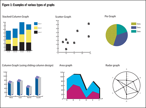
One way that dashboards attempt to provide clarity is through the way that data is presented. Dashboards create visual, at-a-glance displays of data pulled from disparate systems to provide warnings, action notices, next steps, and summaries of conditions. Figure 1 presents some models of displaying indicator information. The most appropriate display is the one that the intended users will best understand. Additionally, it may be beneficial to display the same data in multiple ways so that all perspectives are understood.
Another way that dashboards support different types of users and different types of decisions is through the use of drill-down features. Drill-downs provide multiple levels of information and/or ways of presenting information. Figure 2 provides the general anatomy of a drill-down sequence. The dashboard home page usually provides general information about the dashboard and access points to different functional areas. The summary page is key in the drill-down sequence, as it provides the big picture view and should map what counts in that part of the dashboard. Drill-down capabilities vary: from drilling to an application (preventive maintenance system, directory of contacts, etc.), to more detailed information, or perhaps even to a source document (e.g., a PDF of a prescription in a patient dashboard system). The depth depends upon user needs for detailed and organized information.

For example, the Whatcom community dashboard website provides a list of the types of indicators and a means to select a particular county or the entire state for further drill down. Selecting "health" brings the user to a summary page of health indicators that lists subcategories of health indicators and provides visual guidance (gauges) on performance, including teen birth rate. Selecting teen birth rate drills down to a data page for the teen birth rate indicator. Aside from statistics related to teen birth rate for the region of interest, the data page also provides a definition of the graphic gauge used as a visual indicator.
Providing information on the definition of the indicator and how it is calculated is always a good idea, particularly for indicators that are not part of the daily nomenclature of the organization. Likewise, to ensure understanding, a legend should be provided for interpreting graphics.
Bringing a Community Dashboard into a Hospital Context: The Migration Path
Next, we narrow the focus to bring a community dashboard into a hospital. This process is incremental, and should be approached by taking small steps. Even if a hospital is not ready to launch a full-blown digital dashboard initiative, efforts should be made toward organizing data collection with a dashboard framework in mind. This framework can be very helpful in progressing towards information clarity and efficiency. At a minimum, hospitals should collect data, even if they are unprepared to go live with a digital dashboard.
Multiple incremental steps exist in a dashboard progression; each step provides its own added merits and capabilities to support leaders. Hospitals can jump in where they see fit and migrate to their comfort zone as resources and/or needs expand. Figure 3 shows one possible path of incremental progression beginning with organizing files, taking intermediate steps using excel plug-ins, and ending with a robust, digital dashboard built on a data warehouse. The following list is a sample listing of open source and commercial Excel dashboard plug-ins:
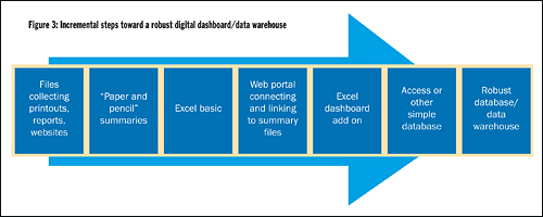
Alternatively, a hospital may migrate from a spreadsheet to a web portal that provides links to various documents and spreadsheets. For example, public health sectors established the NOLA Dashboard (visit www.noladashboard.org) and other dashboards in response to Hurricane Katrina to ensure that New Orleans area citizens would have the most up-to-date information about available health resources.11
At the far right of our incremental steps is the robust digital warehouse. This is where the technology department helps the hospital evaluate big data warehouse vendors, which have integrated dashboard tools.
Bringing a Community Dashboard into a Hospital: The Process
Developing a community dashboard is a project that requires planning, allocating resources, monitoring and getting appropriate buy in, as does any project that has a chance of success. As with other projects where buy-in and end user acceptance matters, users and other stakeholders must be involved early in developing content and design. In a hospital context, this means engaging governance boards, CEO's, medical staff leaders, and representatives of other functional areas the dashboard may engage. Additionally, community leader representation may be necessary to get input on values, design, and to provide resources.12 The following are some questions to consider, generally in priority order, early in the process:
- What is our dashboard designed to do for the organization?
- What practical applications are possible with a dashboard?
- What would be a case example of using the dashboard?
- What data is needed to construct the dashboard?
- Can we collect the data needed? If not, what are the alternatives?
- How can we measure dashboard productivity/success?
- What would an example of "our" type of dashboard look like?13
Creating a Dashboard Prototype
We now describe the creation of a dashboard prototype that focuses on creating the community assessment part of a community dashboard. Much of the process discussed here can apply regardless of whether the dashboard is a simple Excel plug-in, a portal dashboard or the digital dashboard that is the focus on this article.
1) Determining the Content
Again, content begins with determining the hospital's general community goals. What types of information would indicate assets, resources, and conditions related to the community goals? Broad categories may include areas such as health and economic issues, which may be good for summary information. However, it is unlikely that they provide the granularity necessary to identify meaningful indicators defining our data collection. Specificity is important when deciding on indicators. For example, if the goal was to increase high school graduation rates, the hospital might want to use rates of school drop outs, juvenile incarceration, and adolescent parenting as key indicators of current status and trends.
On average, a system will have about five to ten key indicators; enough to provide a picture of what is critical to the hospital without overwhelming the user with details. To broaden the possibilities of potential indicators, the designer(s) may want to consider internal and external options. In fact, a hospital might want to consider going beyond fact data by integrating regional and national benchmarks into the dashboard and systematically translating those data into ways to compare local situations to drive performance excellence.14 In addition, it is quite possible that an indicator already used in managing hospital operations may also have relevance in assessing community needs or progress. For example, a hospital could be monitoring its own emergency department ambulance diversion rates. By adding county diversion rates to its dashboard, users benefit from the regional perspective.
The hospital could also add the number of ambulatory care sensitive, non-urgent emergency department visits to its dashboard to monitor the need for additional outpatient primary care programs, which could reduce the amount of ambulance diversion.
In addition to identifying key indicators, some thought must be given to the ways to sort and aggregate indicator data that are most appropriate for the hospital. The community goal may call for data to be compared based on age, gender, income, or ethnicity, for example.
Envisioning the direct users and the final reports resulting from the dashboard system may also help to identify key indicators. Reports allow a much broader audience beyond direct users to benefit from dashboard data. Reports may be distributed in a number of ways including email, the web or print. The content of a report may include high-level, summary information, a point in time, or a span in time. Though content is the focus at this point in the process, the presentation of the report will also have to be considered.
Indicators designate what information is needed. Once indicators are identified, other questions follow:
What are the sources of the indicator information?
The U.S. Census Bureau, the U.S. Labor Department's Bureau of Labor Statistics, the U.S. Department of Housing and Urban Development, and annual reports prepared by cities, counties and states may be sources of economic data. Some public health data and vital statistics might be obtained from state local departments of health and human services. It might even be prudent to collect data from several sources for comparison. In addition, collaborating with the county public health department and other local hospitals may make it possible to obtain more data more efficiently and develop common goals for greater impact.
What are the time frames of interest for each indicator?
Annual updates may be necessary for graduation rates, quarterly updates for ambulatory care sensitive emergency department visits, and monthly updates for ambulance diversion rates. "Rolling-up" is an option, but it is next to impossible to dissect information when the underlying detail is unavailable.
What are appropriate benchmarks for the indicator?
One of the advantages of using graphics and colors is to provide benchmarking features that can describe whether the indicator value is "good," "fair," or whether a warning or danger signal is needed. Many systems allow warnings to be sent via email to the appropriate person. These features contribute to clarity and decision-making. To utilize these features it is important to identify the relevant ranges for each indicator early. Considering the benchmark and comparisons of interest will help us determine the appropriate indicator later in the process.
2) Determine the Hierarchy and Framework
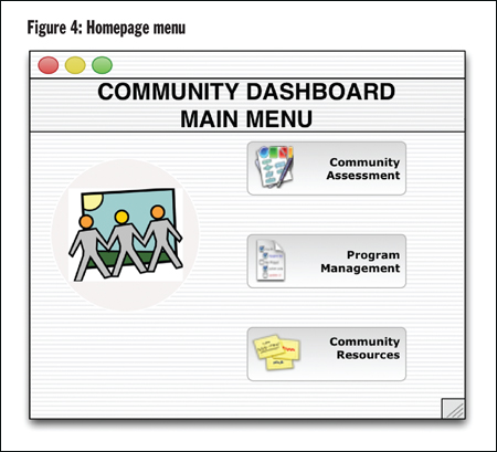
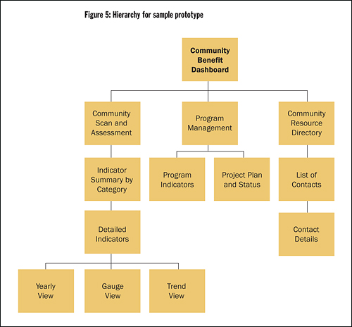
Once the basic building blocks of content are in place, the next step is to determine relationships of interest among the data to develop the framework for the drill-down sequence. The general flow will follow Figure 4. In the case of the community assessment dashboard, the menu options on the home page may provide access to different sections of the community dashboard site. If a user chooses community scan and assessment from the home page, they will be directed to an associated summary page. The summary page provides aggregated categories of key indicators (i.e., a general health or economic gauge) and allows drill-down into detailed data pages. Related subpages provide many possibilities for making sense of the details including: 1) variations of the graphics presentation for each indicator; 2) indicator data separated into demographics, such as age; 3) indicator data presented in various time ranges; or 4) ability to view trends. Figure 5 shows the hierarchical structure used to design the prototype example.
3) Determine the Look and Feel
The use of dashboard display techniques to reformat complex data into easily interpreted graphically-enhanced symbols should make or enhance the user's ability to mine data for important knowledge.15 Color can complement the choice of graphics and tables by showing alerts when something is out or range, or simply to distinguish among multiple tables and graphs on a screen. It is worthwhile to consult a general source that provides visual design guidelines. However, in the end, a user-centered design approach is needed. This approach should anticipate how users will react to the various screens, graphics, and colors as they navigate the dashboard.16 Mockups, which can be as simple as paper-and-pencil drawings, can help involve users in making good design decisions.
Much can go wrong with the choice of graphs and color. It is not just a matter of what looks good. For example, a red/yellow/green gauge not set with appropriate benchmarks could cause potential decision errors.
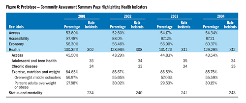
In addition, column headings and labels are important. For example, Figure 6 shows the summary page for the prototype example. It illustrates that different community indicators are reported in different ways (percentage of the population, rate per 100,000 people, and total number of incidents). A user could get the wrong impression if all of these indicators were in the same column of if they interpreted rate or incident as a percentage rather than a count.
4) Develop
If the chosen tool to develop a dashboard is a data warehouse tool (or even Access, in some cases), it may be time to bring in the information technology professionals. However, stakeholders should still be involved in refining screens, confirming the data source for each indicator, and verifying the drill paths. (Figure 7)
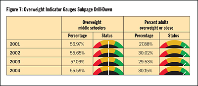
Figures 5, 6 and 7 show the drill-down and design for a very basic, limited hospital community dashboard prototype following the procedure we have outlined here.
5) Go Live and Beyond!
The work is not done when the code is complete. Detailed indicator data needs to be continuously collected and added. Just as with other projects, change-management factors (e.g., training and promoting use) are part of the project.
Evaluating the dashboard's productivity and success should also be considered. Evaluation may occur through pre-determined criteria to evaluate the success as well as through informal feedback. Dashboards, like other systems are "living" and may require adjustment based upon feedback and changes to the community goal.
Conclusion
Migrating towards a digital dashboard need not be that daunting. Recent research indicates that a simple, but comprehensive, hospital dashboard focused on operational indicators and created with limited resources (100 hours including usability testing) increased satisfaction in communication and coordination among health care executives.17 The researchers involved in the study attributed the dashboard's success to a strong plan of action based on user-centered design principles. A community dashboard, as either an addition to an operational hospital dashboard or a standalone, is an even more achievable proposition.
Hospitals can use an incremental approach to work toward a dashboard. Having a digital dashboard in mind from the beginning will facilitate the process in the long run. Information should be finely customized for the needs and tasks associated with the hospital's community goals and overall organizational vision. The community dashboard's emphasis on the right data, summaries, graphics and exception visuals help provide the clarity and conciseness to bridge the gap between mission and margin and allow a hospital to demonstrate that their work within the community makes a difference.
NOTES
- Robert Stanek, "Bridging the Mission-Business Gap in Health Care," Health Progress 89, no. 3 (May-June 2008): 35-37.
- Wayne Eckerson, "What Are Performance Dashboards?" DM Review, October 2005, excerpted from Performance Dashboards: Measuring, Monitoring, and Managing Your Business, (Hoboken, N.J.: John Wiley & Sons, 2005).
- Eric Rosow, et al., "Virtual Instrumentation and Real-Time Executive Dashboards," Nursing Administration Quarterly 27 (2003): 58-76; E.B. Sloane, E. Rosow and J. Adam, "Strategic Graphic Dashboards for Improved Technology Management Decisions," Journal for Engineering in Medicine and Biology Society 4 (September 2003): 3634-3635.
- Andrea Gregg, "Performance Management Data Systems for Nursing Service Organizations," Journal of Nursing Administration 32, no. 2 (2002): 71-78.
- A Dashboard for Community Health Improvement, The Quality Letter for Healthcare Leaders 6, no. 5 (1994): 22-32.
- See note 5.
- See note 5.
- Seth Foldy, et al., "The Public Health Dashboard: A Surveillance Model for Bioterrorism Preparedness," Journal of Public Health Management Practices 10, no. 3 (2004): 234-240.
- Emory Fry and Leslie Lenert, "MASCAL: RFID Tracking of Patients, Staff and Equipment to Enhance Hospital Response to Mass Casualty Events," AMIA Symposium Proceedings (2005): 261- 265, available online at www.pubmedcentral.nih.gov/articlerender.fcgi?artid=1560691.
- Stanek, 35-37.
- Gregory Stone, et al., "Data Collection and Communications in the Public Health Response to a Disaster: Rapid Population Estimate Surveys and the Daily Dashboard in post-Katrina New Orleans" 13, no. 5 (September/October 2007): 453-460.
- Charles Denham, "Leaders Need Dashboards, Dashboards Need Leaders," Journal of Patient Safety 2, no. 1 (2006): 46-53.
- John Riedel, "Using a Health and Productivity Dashboard: A Case Example" (2007), available online at www.healthpromotionjournal.com/publications/art.htm.
- Nancy Donaldson, et al.,"Leveraging Nurse-Related Dashboard Benchmarks to Expedite Performance Improvement and Document Excellence," Journal of Nursing Administration 35, no. 4 (2005): 163-72.
- Sloane, Rosow and Adam, 3634-3635.
- Seth Wolpin, "An Exploratory Study of an Intranet Dashboard in a Multi-State Healthcare System," Study of Health Technology Information 122 (2006): 75-79.
- Wolpin, 75-79.
Copyright © 2008 by the Catholic Health Association of the United States.
For reprint permission, contact Betty Crosby or call (314) 253-3477.